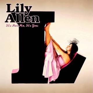
Lily Allen is pictured on the front, sitting inside a large 'L' shape. She takes up about half of the cover, and is centered. The colour scheme is simplistic, just black, baby pink and a beige backdrop. Her name and the title of the album 'It's Not Me It's You' are in the top left hand corner, with her name in a much larger font. The baby pink and the beige work well in making the black L really jump out of the cover so that even if you were just glancing it at it you'd see it straight away. The way Lily Allen is curled up inside the L looks quirky and cool and in-keeping with the fun and playful mood of the album, and her name in the top left hand corner stands out because of it's thin pink outline.

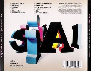
There is more going on on the back, although the main theme carries through: the beige back drop, pastel colours, large 3D letters jumbled around, and black as the main colour. The font is also consistent, and the tracks are listed in the top left hand corner in two columns. The bar code is in the bottom right hand corner, and the names of the record companies etc. are listed in the bottom left hand corner. The spine is black, with her name and the album title written in baby pink. If someone has stopped for long enough to look at the back cover of the CD it means they're definitly interested in buying it, so they can afford to have more information on the back. Even so, it is kept simple yet bold, with just two more colours introduced, still pastels, and is still in keeping with the fun, light-hearted theme.
What I think is so effective about this album cover is it's simplicity and slight quirkiness. It's not overdone with effects and loud colours, there is just a simple but eye-catching colour scheme, and a design that grabs your eye at once. You immediately know that it's Lily Allen's CD, her photo and her name are used as the selling point on the front, and the colour scheme matches the playful mood of the album. The 3D letters are also something slightly different and interesting that set the album cover apart.


No comments:
Post a Comment