Our Final Video

CLICK THE PICTURE BELOW TO GO LEXI GRACE'S OFFICIAL WEBSITE

OUR FINISHED ALBUM COVER

OUR FINISHED ALBUM COVER

Saturday, November 20, 2010

The Website

This is the photo we have decided to use as the background for all of the pages of our website:


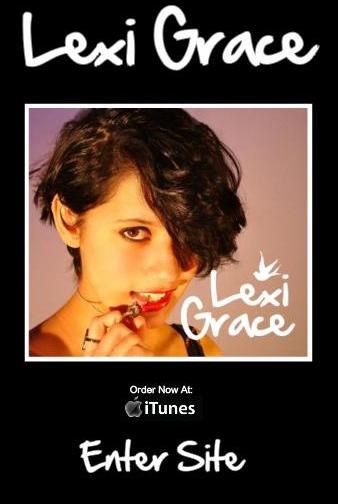
This is because she looks sophisticated and sexy, and the red colour of her lips jumps out nicely from an otherwise neutral background. The lighting is also warm and inviting. The background is not too cluttered and would leave room for content especially up the left hand side.

The website is going well so far. We're using a programme called wix.com to create it and it is far simpler to use than dreamweaver as it enables us to work with flash in designing it.


This is the website in progress:


As you can see, everything is very easy to navigate, with all of the things you can insert such as text, page areas etc. available up the left handside, and all of the page components easily moveable around the page.

We have decided it is essential to include:

  • Some basic information about Lexi
  • The finished music video
  • Events
  • Sponsors (eg. a clothes shop? a make up line?)
  • Links to Lexi's twitter and facebook etc.
  • Photos
  • A fan page
  • A competition
  • Maybe a forum?

Saturday, November 13, 2010

Third Shoot

The main aim of our third shoot was to get all of the lipsyncs sorted. There were a lot of problems with the lip sync footage before as our actress was nervous, it was cold, and the lighting wasn't ideal. So after practicising in the Seward Studio with Liv, and having fun singing the song together so that she lost all of her inhibitions, we felt we were ready to go on our second shoot. We decided to have her lip syncing set against different coloured walls we stumbled across as we were shooting clips for the montages of her walking. There were five different coloured walls; white, purple, red, pink and yellow which served as vibrant and interesting backdrops for her singing. This second shoot went a lot more smoothly. We knew exactly what footage we needed to get, Liv was far more comfortable as this was the second time round, the weather was perfect, and we remembered to bring speakers.

While on location, we also took some extra photos of Liv, for use on the website, to add some variation to the more 'glossy' studio shoots we had taken in the Seward Studio.


Saturday, November 6, 2010

Photos for our Album Cover

These are the photos we have decided to use for our final album cover:


This shot is simple but effective - it's an establishing shot of the artist Lexi. The photo directly addresses the audience as she is making eye contact and the whole focus is on her face. As she is a debut artist is important that her identity is anchored and as a group we decided that this was the perfect shot to do this. She's also biting her necklace which makes it slightly sexualized and appealing to males.


We decided to use this photo to go across both panels on the inside, so that on the left panel, she is looking over to the right panel at her shadow. We also might superimpose the shadow of a bird on the right panel, as this is her motif.


This photo adds variety to our shots as it is a MCU. The jumper further anchors the 'swallow' motif, and there is space to have the track listings up the left hand side.

Wednesday, November 3, 2010

Album Cover Research

What works and what doesn't
I've had a look through some disk covers of artists similar to "Lexi Grace", to see the conventions; what works and what doesn't. They are not necessarily all album covers, I have included some singles as well, as I wanted to get an idea of placement (i.e. where the photos and text are laid out) and what catches the eye as well. The common theme demonstrated on the photos below seems to be simplicity. Whether it be an album cover or a single cover, they all feature a photo of either the artists' head and shoulders or full body, in a pose that anchors in the theme of the album or single, with a simple colour scheme and minimal text. There are no fancy effects, it's not too busy, the focus is just on the artist and her single/album. Even Lady GaGa's debut album cover, an artist known for being "out-there" and quirky, follows this formula, so it is definitely a convention we should consider following.